

How to think about Data Science and what happens if we don’t?
How to think about Data Science and what happens if we don’t?

Taking my shot at deconstructing the buzzword.
It is easy to forget that a data scientist is a relatively new term and not really a thing in the standard english language yet. It is a field that combines old topics and methodologies in new ways. Due to the lack of formal requirements or a formal definition, it has become a term that is (self-)attributed rather than defined in a person. It has become a term that is very sloppily used and highly buzzed. This, as is the case with Big Data causes people in the field to crack jokes at it.
Nate Silver: “I think data-scientist is a sexed up term for a statistician.”
All of this is noise, not bringing us any closer to the answer of the question in the title. So instead of thinking about the person, we should rather look at the process that is behind data science.
The following graph is taken from Ben Fry’s Dissertation Computational Information Design. It encompasses the larger process that stands behind everything that Data Science incorporates. He also puts the fields that maps best to the disparate tasks on top of it.
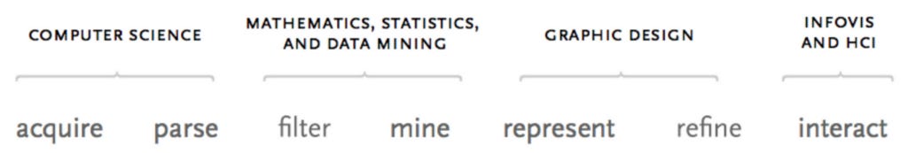
It is easy to see now why people have such a hard time determining who a data scientist is. Not only is it a huge interconnected field, it also encompasses several different roles (e.g. statistician, as Nate Silver mentioned).
Data Wrangling/Munging
Sourcing the data is the beginning of every data science project. After data is surfaced, it has to be brought into a format that can be further used. This can include the extraction of time series data from machine sensors, a questionnaire of consumers or getting structured relational data about an organization. I personally am usually not involved in this task, as I rely on others to pre-process the data which then will be accessed by me.
Data Modeling and Analysis
This is what most people think is “data science”. It encompasses the exploratory analysis of the data and the application of models in order to reveal insights and stories from the data.
Data Visualization
Here we map data to visual artifacts in order to communicate our message most effectively. This also encompasses the interactivity, where the audience can engage as well as draw new personal conclusions from the data. Visualization provides an overview as well as visual context, it should enable the viewer to recognize patterns or the lack thereof.
Not seeing the whole process
Going back to the original graph by Ben Fry, it seems to be a very linear process. The reality is that all these processes are highly interconnected and facts that are revealed in the data visualization can feed back into the data acquisition process. When these steps are decoupled (as is often the reality), a lot of context and implicit knowledge is lost.
We learned this the hard way during the 2016 election, when pretty much every respected outlet predicted the outcome of the election wrong.
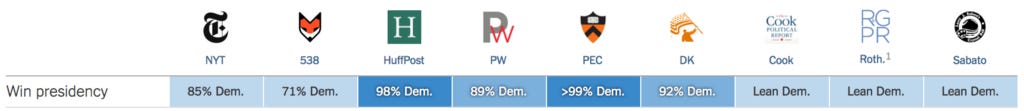
Using our hindsight wisdom, we can now say that something very early in the prediction pipeline went wrong. As is described in this post-mortem from Huffington Pollster, the methodology of how data was collected mattered a lot. And Polls itself have a high margin of error. No model or visualization technique will be able to even this out. Vice-versa, if a model or visualization is applied the wrongly, it will go wrong. If there is one takeaway from this post, it should be that Data Science must always be seen as one whole. That is despite of how things are split up and or narrowed down for the individual in the process.
How to think about Data Science and what happens if we don’t? was originally published in Hai Nguyen Mau on Medium, where people are continuing the conversation by highlighting and responding to this story.